Twilight Dial — Visual Identity for a Nostalgic Live Music Experience
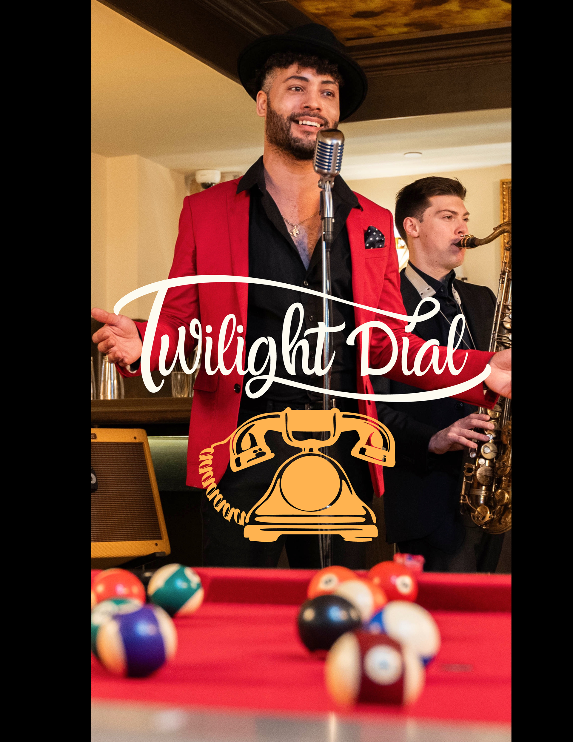
Twilight Dial is a brand built for a charming, retro-inspired music affair—something between a vintage diner jukebox and an elegant local lounge. Drawing from 1940s–50s Americana, the identity needed to feel familiar yet elevated: nostalgic, playful, and polished.
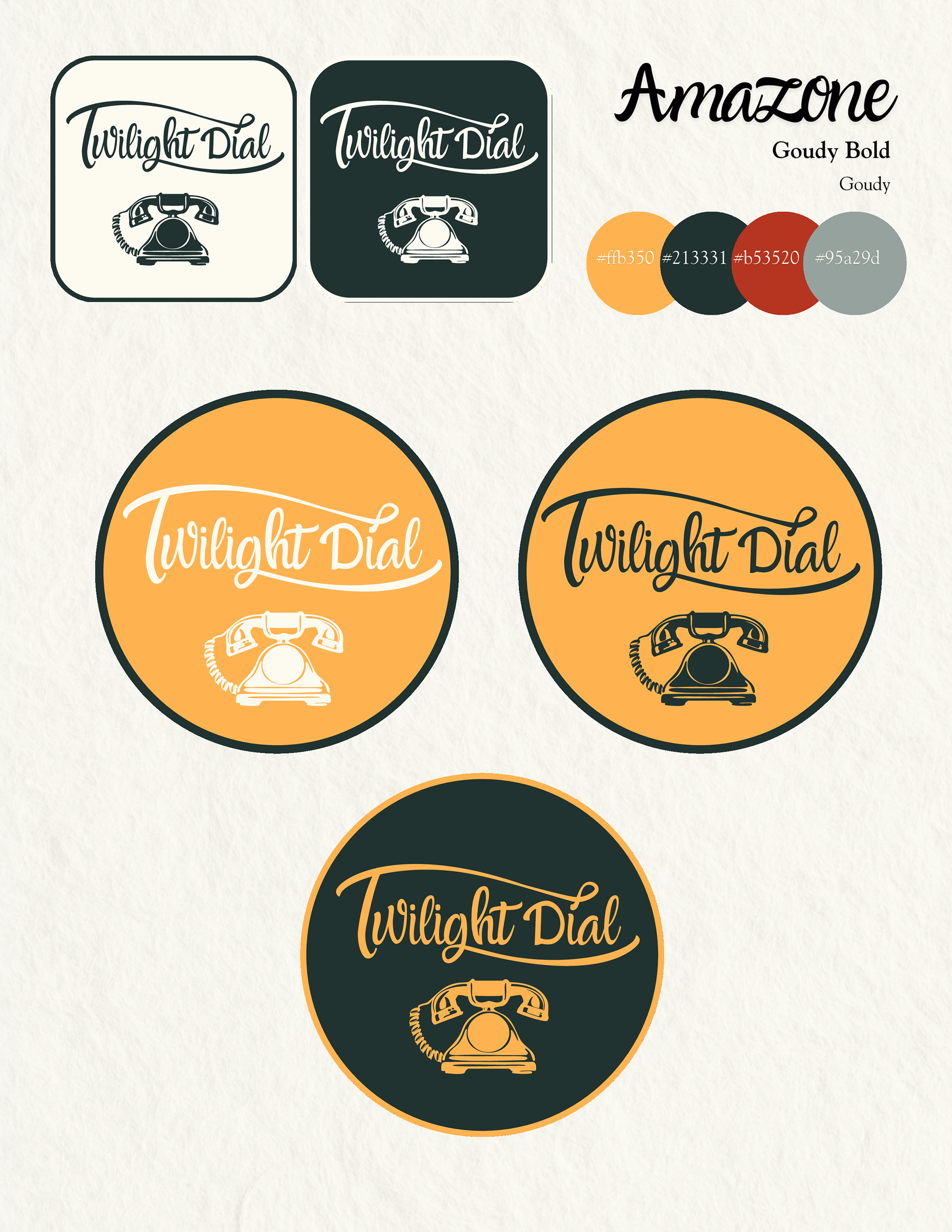
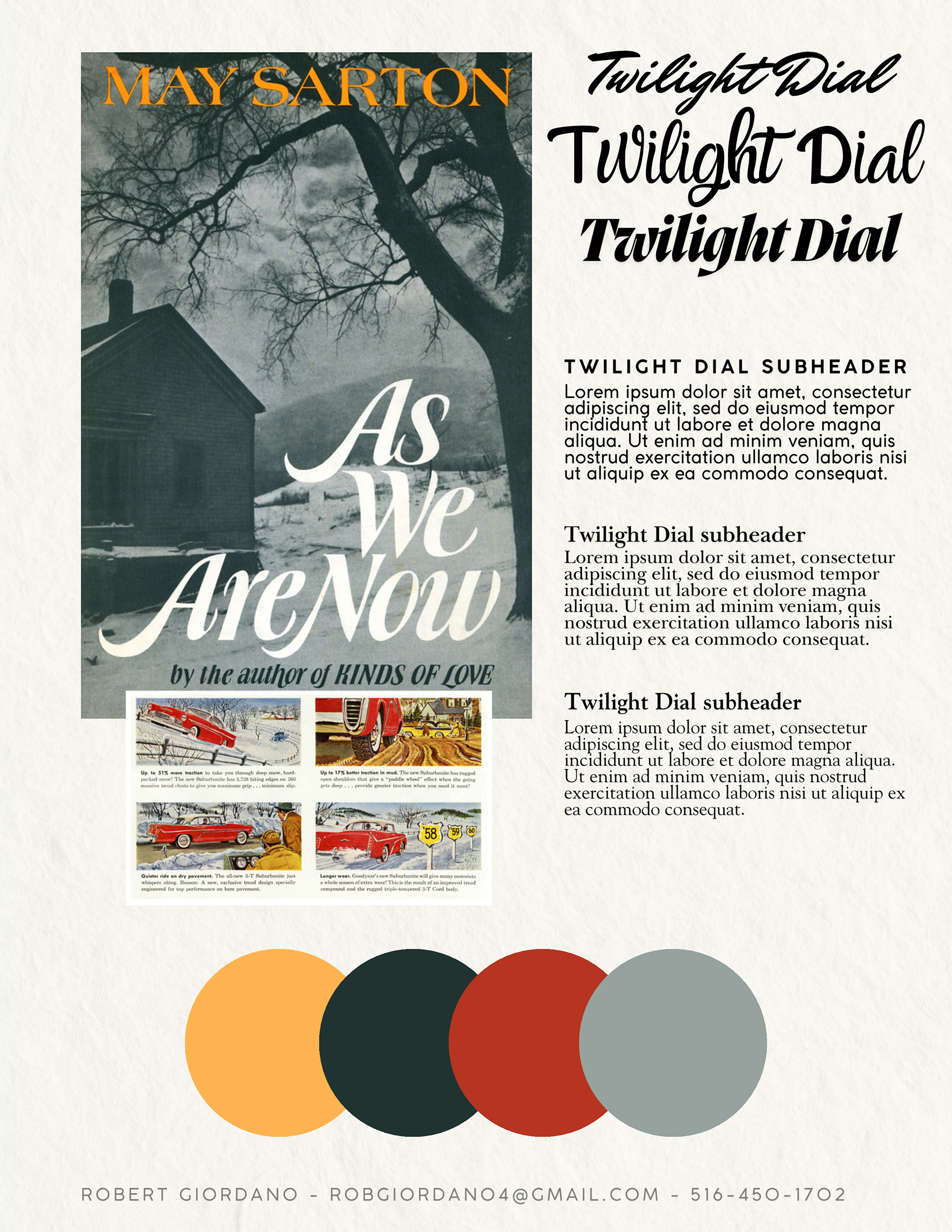
Final Logo
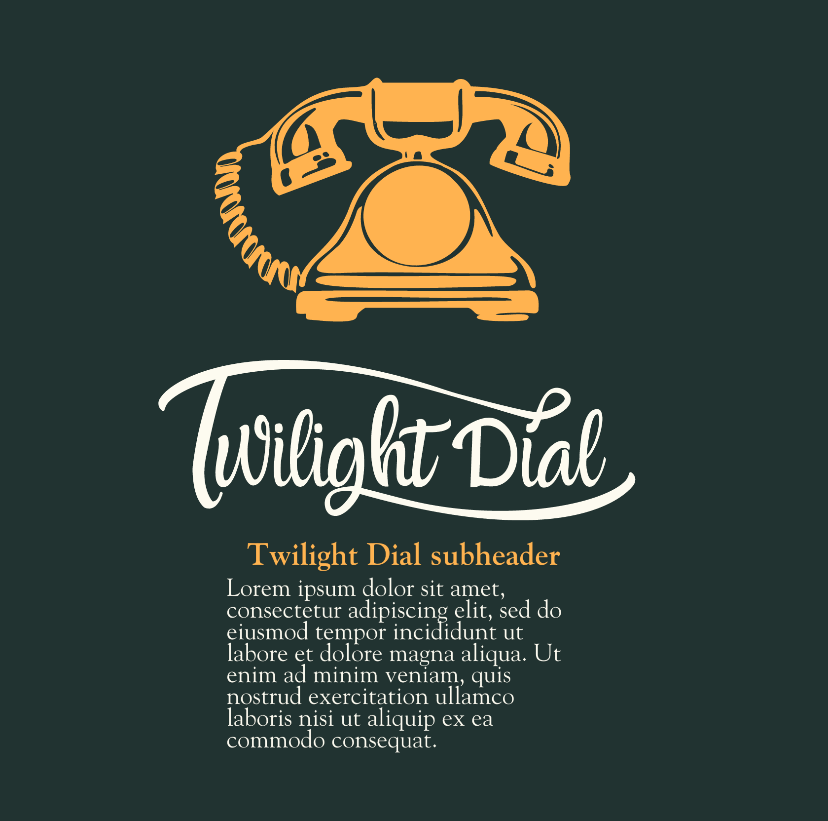
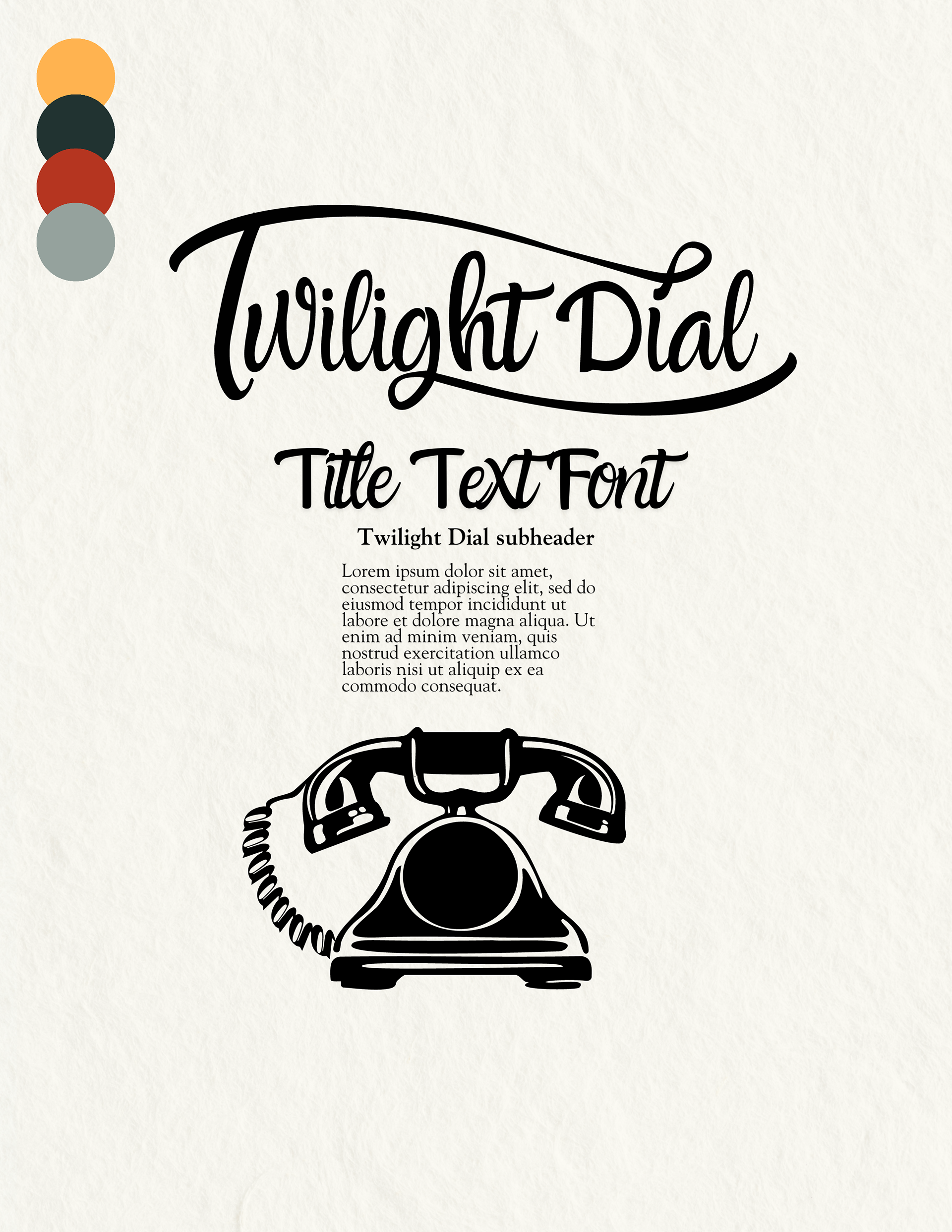
The logo is a loving nod to mid-century Americana—featuring bold, swooping letterforms with a playful rhythm and a hint of neon-era flair. It’s instantly evocative of roadside diners, vinyl records, and late-night radio, while still feeling clean and adaptable for modern applications.
Design Process
The process began with a deep dive into retro Americana: signage, matchbooks, jukebox labels, and vintage diner menus. Sketches and references informed a direction that felt both referential and original. The result is a warm, welcoming brand with personality—perfect for intimate local venues that want a little flair with their ambiance.
Color Story
The palette balances warmth with deep vintage hues: dusty orange, buttercream, brick red, and rich burgundy. Together, these colors capture the feeling of chrome booths, retro cars, and soft jukebox glows—cozy yet elevated, retro without being kitschy.
Typography
Typography is a key player in Twilight Dial’s personality. The headline font has just the right amount of swing and charm—reminiscent of hand-painted signs—while the secondary typeface brings in a crisp, readable contrast. Together, they set the tone for an experience that’s as classy as it is approachable.